
I see a lot of websites in my travels while seeking out news stories for Jalopnik. Most of them include endless annoying pop-up prompts, turning web browsing into a game of whack-a-mole just to see what you’re looking for in the first place. Many articles are locked behind paywalls (usually AFTER showing you the pop-up so they still get their ad revenue), though there are ways around that. But today, I want to rant about the general layout and design itself.
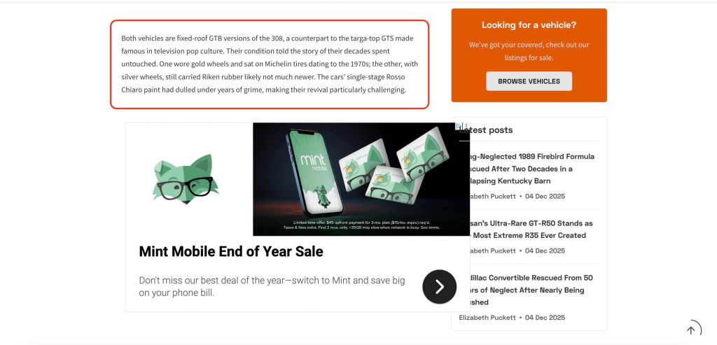
Here’s what I just encountered while attempting to read an article I was otherwise interested in. I won’t name the website to save them embarrassment. I added the red box to highlight the only small portion of the page that was actually useful to me, one short paragraph of the otherwise good article. The entire rest of the screen was utterly irrelevant. If I was looking for a vehicle, I’d be on Facebook Marketplace or maybe Craigslist (since I can’t afford anything new or lightly used), not reading about classic Ferraris. I don’t need to read the latest unrelated posts on the site. Not that I can make them out, because the poorly placed Mint Mobile ad covers up part of the Latest Posts window, so I can’t read those headlines very well anyway.
It seems that since publications don’t spend money on paper anymore, some dedicate as much space as they possibly can to ads and clickbait rather than the content people actually want to read. It’s yet another example of the continuing trend of enshittification across the internet, electronic devices, and society in general. Back in the day, I didn’t mind skipping a few pages of ads in print magazines in order to enjoy beautiful layouts on the pages that matter. (To its credit, ADVRider‘s magazine is one of the few that still 1. exists, b. does this, and iii. does it well. And I’m not just saying that because I write for it sometimes.)
Now get off my lawn.
Discover more from Justin Hughes
Subscribe to get the latest posts sent to your email.
